CMYK Everything You Need to Know About This Essential Color Model
Whether you’re a graphic designer preparing files for a client presentation, a marketing professional overseeing brand materials, or a small business owner creating your first brochure, understanding color models is fundamental to achieving print success. The vibrant colors you see on your computer screen don’t always translate perfectly to paper, and this disconnect can lead to disappointing results and costly reprints. The solution? Mastering the CMYK color model—the foundation of modern color printing.
In this comprehensive guide, we’ll explore everything you need to know about CMYK, from its basic principles to advanced color management techniques. By the end, you’ll understand how this essential color system works and why it’s crucial for anyone involved in print design.
What Is CMYK? Understanding the Four Color Process

CMYK represents a subtractive color model used extensively in color printing, where the acronym stands for the four ink plates used in the printing process: Cyan, Magenta, Yellow, and Key (Black). This system is also commonly referred to as process color or four color printing.
What Does CMYK Stand for in Printing?
Each letter in CMYK represents one of the primary ink colors:
- C = Cyan (a bright, greenish-blue color)
- M = Magenta (a purplish-red color)
- Y = Yellow
- K = Key (Black)
According to Walsworth’s printing process guide, the “K” stands for “Key” or “key plate,” which traditionally represented the plate with the most detail and could be used to outline an image as a guide. Using “K” instead of “B” avoids confusion with blue, making the abbreviation clearer for print professionals.
How Does CMYK Color Model Work?
The CMYK color system operates fundamentally differently from the way your computer monitor displays colors. Understanding CMYK printing requires knowledge of subtractive color mixing, where the model works by partially or entirely masking colors on a lighter background, with the ink reducing the light that would otherwise be reflected.
When you print a design onto white paper, the paper starts by reflecting all wavelengths of light, appearing white to the human eye. As colored inks are applied to the surface, each ink absorbs certain wavelengths of light while reflecting others:
- Cyan ink absorbs red light and reflects blue and green wavelengths
- Magenta ink absorbs green light and reflects red and blue wavelengths
- Yellow ink absorbs blue light and reflects red and green wavelengths
- Black ink absorbs all wavelengths, creating deep shadows and crisp details
By layering these inks in different amounts and combinations, printers can reproduce a wide spectrum of colors. The key to understanding CMYK is recognizing that color is created by subtracting light from the white background, rather than adding light as screens do.
The Science Behind Subtractive Color Model
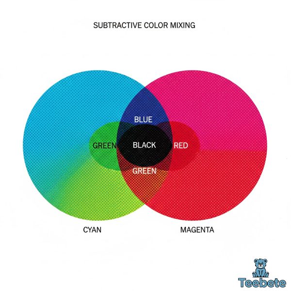
The subtractive color model represents a fundamental principle in color printing that differs significantly from how digital displays create color. Understanding this distinction is essential for anyone working between digital and print mediums.
Subtractive vs. Additive Color Mixing
In subtractive color mixing, colors are created by removing specific wavelengths of light from white. When cyan, magenta, and yellow inks overlap in equal amounts, theoretically they should produce black by absorbing all light wavelengths. However, in practice, combining these three inks results in a muddy brown due to pigment imperfections. This is precisely why black ink is added as a separate component in the CMYK system.
The opposite principle applies to additive color mixing, which is used in RGB displays. In additive systems, colors start as black (no light), and red, green, and blue light are added in various intensities to create the full spectrum of colors you see on screens.
Why Is Black Called K in CMYK?
The inclusion of black ink in the CMYK model serves multiple practical purposes beyond compensating for imperfect pigments. Black ink enhances contrast, sharpens details, adds depth to printed materials, and improves efficiency by reducing the amount of cyan, magenta, and yellow required to create dark tones. For text, photographs with deep shadows, and detailed illustrations, black ink is absolutely indispensable.
Additionally, using a dedicated black ink is more cost-effective than layering three inks to approximate black, and it produces significantly sharper results—particularly important for small text and fine lines.
How CMYK Printing Works: From Digital File to Physical Print
Understanding the mechanics of how CMYK translates a digital design into a physical print helps explain why certain colors shift during the conversion process and how to achieve better results.
The Role of Halftone Printing
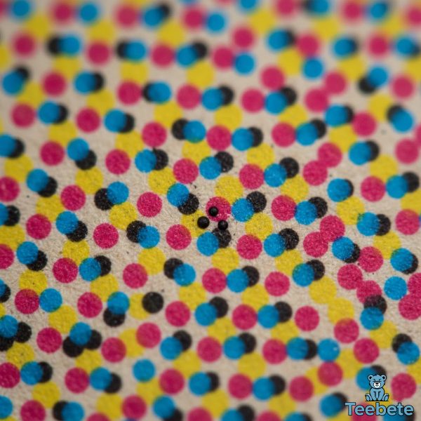
Professional printing doesn’t simply apply solid blocks of cyan, magenta, yellow, and black ink to paper. Instead, halftone dots serve as the fundamental building blocks of color reproduction in printing. Halftoning allows for continuous variability of each color through tiny dots that the eye perceives as lighter and less saturated than pure ink.
For example, a 20% magenta halftone produces a pink color because our eyes perceive the small magenta dots scattered across white paper as a lighter, less saturated version of magenta. This halftone pattern, combined with different screen angles for each color, enables the reproduction of millions of color variations using just four inks.
The quality of halftone printing depends on the screen frequency (measured in lines per inch or LPI) and the angles at which screens are positioned. Higher screen frequencies and optimized angles produce finer detail and smoother color transitions, resulting in professional-quality prints.
Color Separation and the Printing Process
When a digital file is prepared for offset printing or digital printing, it undergoes color separation—a process where the image is divided into its four CMYK components. In offset printing, each color gets its own plate and is then loaded on its own plate cylinder, with each color printed sequentially or simultaneously depending on the printing technology.
Modern printing presses precisely control the amount of each ink applied to the substrate through sophisticated digital controls and mechanical precision. The result is accurate color reproduction that maintains consistency across thousands or millions of impressions.
CMYK vs RGB: Understanding the Difference Between CMYK and RGB Color Models

One of the most common challenges in print design is understanding the fundamental differences between CMYK and RGB color models. These two systems serve different purposes and operate on entirely different principles.
When to Use CMYK vs RGB for Printing
CMYK is designed for printed materials, providing color consistency across physical media like paper and fabric, while RGB is optimized for screens and digital content. The distinction between these color models is critical for achieving the best results in both digital and print applications. The rule is straightforward:
- Use RGB for websites, mobile apps, digital presentations, social media graphics, video content, and anything displayed on electronic screens
- Use CMYK for brochures, business cards, posters, packaging, magazines, books, and any physical printed materials
The distinction matters because each system has its own color gamut—the range of colors it can reproduce. RGB creates colors by combining red, green, and blue light, while CMYK relies on the physical mixing of ink to produce desired hues on paper. These different methods result in different color capabilities.
RGB Color Space vs CMYK Color Gamut
RGB displays can produce extremely bright, saturated colors that are simply impossible to reproduce in CMYK. Vibrant blues, electric greens, and neon colors that look stunning on screen often become noticeably duller when printed. This isn’t a flaw in the printing process—it’s a fundamental limitation of pigment-based color reproduction.
Conversely, certain CMYK color combinations can produce subtle variations and textures that RGB struggles to replicate. However, the more significant challenge for designers is managing the colors that RGB can display but CMYK cannot reproduce.
CMYK printers often have a relatively small color gamut compared to RGB displays, which explains why that brilliant electric blue in your design may print as a more subdued navy. Understanding these limitations before you design can save considerable frustration and revision time.
How to Convert RGB to CMYK for Print: Best Practices
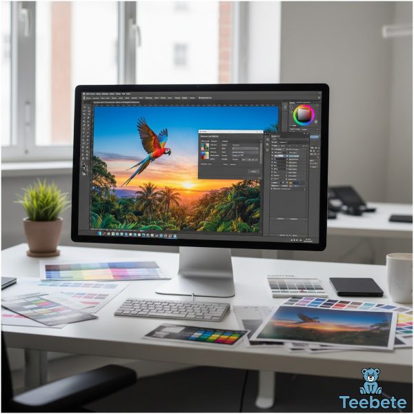
Converting files from RGB to CMYK is one of the most critical steps in preparing designs for print. Done improperly, this conversion can result in significant color shifts, muddy images, and disappointing final products.
Understanding CMYK Color Values for Printing
CMYK colors are defined by percentages of each ink, ranging from 0% to 100%. For example, in the CMYK mode, each pixel is assigned a percentage value for each of the process inks, with the lightest colors assigned small percentages and darker colors higher percentages:
- Vivid Red: C=0%, M=100%, Y=100%, K=0%
- Pure Cyan: C=100%, M=0%, Y=0%, K=0%
- Deep Black: C=0%, M=0%, Y=0%, K=100%
- Rich Black: C=60%, M=40%, Y=40%, K=100%
When converting from RGB to CMYK, these percentage values are calculated based on the original RGB values. However, the conversion isn’t purely mathematical—it also depends on color profiles and rendering intents.
The RGB to CMYK Conversion Process
Adobe Photoshop and Illustrator are industry standards that offer sophisticated tools for color conversion and management to maintain color fidelity during conversion. Here’s the recommended process for professional conversion:
- Start with the Correct Color Profile: Before conversion, ensure you’re using the appropriate CMYK profile for your print provider. Common profiles include US Web Coated (SWOP) v2, Coated FOGRA39, and Japan Color 2001 Coated.
- Use Professional Software: Adobe Creative Suite applications provide the most reliable RGB to CMYK conversion tools. Programs like Photoshop, Illustrator, and InDesign allow you to control conversion settings precisely.
- Enable Soft Proofing: Utilize the soft proofing feature in your software to get a simulated preview of how colors will look in print before releasing final files. This helps you identify problematic colors before committing to print.
- Manual Color Adjustment: After conversion, carefully review your design for color shifts. You may need to manually adjust some colors to ensure they match your original design intentions as closely as possible.
- Check Critical Colors: Pay special attention to brand colors, skin tones, and critical design elements that must maintain specific color values.
Common RGB to CMYK Conversion Challenges
Several predictable issues arise during conversion. Many programs translate 100% Blue in RGB into a somewhat purple-looking color in CMYK, with a recommended CMYK value of 100-65-0-0 for a nice clean blue. Neon colors become muted because CMYK pigments can’t reproduce these extreme saturations. Rich blacks may look washed out if you use only K=100%, which is why rich blacks with additional CMY values provide deeper, more saturated results. Color profile mismatches can also cause unexpected color shifts throughout your document.
What Colors Can CMYK Reproduce Accurately?
Understanding the CMYK color gamut helps designers make informed decisions when creating print-ready artwork. While CMYK can reproduce millions of colors, certain hues present challenges.
Colors Within the CMYK Gamut
CMYK excels at reproducing earth tones like browns, tans, and beiges; most greens and blues within normal saturation ranges; reds, oranges, and yellows with moderate intensity; neutral grays and blacks; pastels and subtle color variations; and most photographic colors from natural scenes.
These colors translate reliably from screen to print with minimal adjustment, making them safe choices for designs where color accuracy is paramount.
Colors Outside the CMYK Gamut
Challenging colors include bright saturated blues and violets, electric greens and lime colors, neon and fluorescent hues, metallic and pearlescent effects, and extremely bright cyans and magentas at maximum saturation.
For these special colors, designers often turn to spot color systems like Pantone, or extend the CMYK gamut with additional inks in systems like Hexachrome (CMYKOG).
CMYK vs Pantone: Understanding the Difference Between CMYK and Pantone Colors
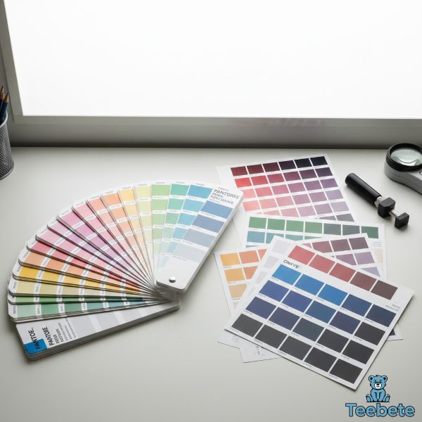
While CMYK is the standard for full-color printing, the Pantone Matching System (PMS) serves a different but complementary purpose in professional printing.
What Are Spot Colors?
The Pantone Matching System uses a numbering system for accurately identifying colors, with every Pantone color having a unique code corresponding to a pre-mixed ink formula. Unlike CMYK process colors that are created by combining four inks in varying percentages, Pantone spot colors are pre-mixed prior to being placed into the printing press and are generally applied as solid, standalone ink impressions on the paper.
Pantone colors include metallic, fluorescent, and other special effect colors that cannot be reproduced using standard CMYK inks. For corporate branding where color consistency is critical, spot colors provide unmatched accuracy across different print runs, papers, and printing facilities.
Combining CMYK and Spot Colors
Many print projects use both techniques simultaneously. You can use both CMYK printing for images and spot colors for company logos or product names when they need to appear close to each other. This combination provides the best of both worlds: full-color imagery with precise brand color reproduction.
However, using spot colors increases printing costs because each spot color requires its own printing plate and ink. For projects with limited budgets, designers often find the closest CMYK equivalent to Pantone colors, accepting slight variations in exchange for cost savings.
Color Management and ICC Profiles
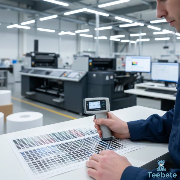
Professional color reproduction requires sophisticated color management systems that ensure consistency from design through final production.
What Are ICC Profiles?
ICC profiles are standardized sets of data that characterize how specific devices reproduce colors, accounting for variables like paper type (coated, uncoated, newsprint), printing technology (offset, digital, inkjet), ink characteristics and behavior, and press settings and conditions.
The color management system uses ICC profiles to properly translate digital data between devices in order to maintain appearance within limits of device capability. Using the correct ICC profile ensures that your colors are translated as accurately as possible from your design software to the printing press.
Color Accuracy Across Different Print Media
Different substrates affect how colors appear in the final print. Glossy coated paper produces vibrant, saturated colors with strong contrast. Uncoated paper absorbs more ink, resulting in softer, more muted colors. Textured papers create unique visual effects but may reduce detail clarity.
When designing for print, always consider the final substrate and request printed proofs on the actual paper stock whenever possible. What looks perfect on premium gloss paper may appear entirely different on recycled kraft stock.
Advanced CMYK Techniques for Print Design
Professional designers employ various strategies to maximize CMYK’s capabilities and work around its limitations.
Using Extended Color Gamuts
Some printing technologies extend beyond standard CMYK by adding additional ink colors. Using a CcMmYK process, with the addition of light cyan and magenta inks to CMYK, can solve problems with light saturated colors and halftone patterns. Many modern inkjet printers use six or more ink colors to expand the reproducible color range and improve photo-quality output.
High-end commercial printing may use systems like:
- Hexachrome (CMYKOG): Adds orange and green to standard CMYK
- CcMmYK: Incorporates light cyan and light magenta
- CMYK + Spot Colors: Combines process colors with specific brand colors
These extended gamut systems provide more vibrant colors and smoother gradations but come at increased cost and complexity.
Optimizing Files for Offset Printing
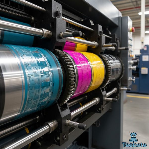
Offset printing remains the gold standard for high-volume commercial printing. To achieve optimal results, convert all images and elements to CMYK before creating your final document, use appropriate resolution (typically 300 DPI at final print size), build colors using CMYK values rather than relying on automatic conversions, set proper bleed (typically 0.125 inches) to account for trimming variations, and create rich blacks for large solid areas rather than relying on K=100% alone.
Total Ink Coverage and Print Limitations
Professional printers specify maximum total ink coverage (also called Total Area Coverage or TAC) to prevent issues like extended drying times, ink offsetting onto adjacent sheets, paper warping or buckling, and color contamination.
Typical TAC limits range from 240% to 320% depending on paper stock and printing technology. This means the sum of all four CMYK percentages shouldn’t exceed the specified limit. Professional design software can flag areas exceeding TAC limits, allowing you to adjust colors before printing.
Web to Print: Managing Color Across Digital and Physical Media
For brands like Teebete that maintain both digital presence and printed materials, managing consistent color across both mediums presents unique challenges.
Creating Brand Guidelines for Multiple Media
Successful brands develop comprehensive color guidelines that specify primary RGB values for digital applications, CMYK equivalents for print materials, acceptable color variation ranges, Pantone spot colors for critical brand elements, and instructions for when to use each color specification.
These guidelines ensure brand consistency whether customers encounter your brand on a website, mobile app, social media, printed brochure, or physical product packaging.
Testing and Proofing Workflows

Before committing to large print runs, implement rigorous proofing workflows including soft proofing (use calibrated monitors and ICC profiles to preview print colors on screen), digital proofs (request high-quality digital proofs from your printer), press proofs (for critical projects, request actual press proofs using production inks and paper), and color matching sessions (work directly with your printer to match critical colors under standard lighting conditions).
Practical Tips for Working with CMYK
Whether you’re new to print design or looking to refine your process, these practical tips will help you achieve better results.
Design Tips for Better CMYK Results
Start in CMYK when possible if you know your design will be printed, work in CMYK from the beginning to avoid conversion issues. Be conservative with bright colors by choosing slightly less saturated colors that will reproduce reliably in print. Test critical colors by printing test sheets of important colors on your target paper stock. Avoid pure white text on colored backgrounds by adding a small amount of color to “white” text to improve trapping and reduce printing issues. Build blacks strategically using C=40%, M=40%, Y=40%, K=100% for rich blacks in large areas, but stick with K=100% for small text.
Working with Print Providers
Establish clear communication with your printing partner by requesting their specific CMYK profile and ICC color profiles, discussing paper stocks and how they affect color reproduction, asking about their TAC limits and other technical specifications, reviewing printed proofs under standard lighting (D50 or D65), and keeping samples of approved prints for future reference.
Common CMYK Mistakes to Avoid
Forgetting to convert RGB files for print almost always results in unexpected color shifts. Assuming screen colors will match is a mistake because your monitor, even calibrated, cannot accurately display how CMYK inks will appear on paper. Ignoring color profiles by using generic CMYK profiles instead of your printer’s specific profiles reduces color accuracy. Overlooking total ink coverage by exceeding TAC limits causes practical printing problems. Not requesting proofs is a gamble that often results in expensive reprints.
The Future of CMYK and Color Printing
While CMYK has been the printing industry standard for decades, color printing continues to evolve with new technologies and capabilities.
Digital Printing Advances
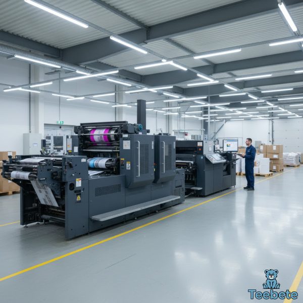
Modern digital printing technologies have dramatically improved CMYK reproduction quality while reducing setup costs and minimum order quantities. Digital presses now rival traditional offset quality for many applications, with advantages including variable data printing for personalization, faster turnaround times without plate creation, cost-effective short runs, and integration with web-to-print workflows.
Expanded Color Gamut Printing
The trend toward expanded color gamut printing systems continues to grow. By adding orange, green, violet, or light ink variants, modern presses can reproduce colors previously limited to spot color printing. This technology bridges the gap between CMYK limitations and RGB’s extensive color range.
Sustainable Printing Practices
Environmental concerns are driving innovation in printing inks and processes. Water-based inks, vegetable-oil-based inks, and reduced VOC formulations provide more sustainable options while maintaining CMYK’s color reproduction capabilities. These developments ensure CMYK printing remains viable and environmentally responsible.
Conclusion
The CMYK color model remains the cornerstone of professional color printing, enabling the reproduction of millions of colors using just four inks: cyan, magenta, yellow, and black. Understanding how this subtractive color model works, how it differs from RGB, and how to manage the conversion process between digital and print is essential for anyone involved in creating printed materials.
From the fundamental principles of subtractive color mixing to advanced techniques like ICC color management and extended gamut printing, mastering CMYK empowers designers, marketers, and business owners to achieve consistent, high-quality print results. While challenges exist—particularly when converting from RGB’s broader color gamut—following best practices and working closely with professional print providers ensures your printed materials accurately reflect your creative vision.
Whether you’re designing business cards, creating marketing collateral, or developing comprehensive brand guidelines, a solid understanding of the CMYK color system is invaluable. As printing technologies continue to advance, CMYK remains the reliable foundation upon which exceptional print quality is built.
Summary Table: CMYK Color Model Quick Reference
| Topic | Key Information |
|---|---|
| What is CMYK? | Subtractive color model using Cyan, Magenta, Yellow, and Key (Black) inks for color printing |
| CMYK Stands For | C=Cyan, M=Magenta, Y=Yellow, K=Key (Black) |
| How CMYK Works | Creates colors by subtracting light from white paper through layered ink application |
| Color Model Type | Subtractive (removes wavelengths) vs. RGB additive (adds light) |
| Primary Use | All printed materials including brochures, posters, packaging, magazines, and business cards |
| Why “K” for Black | “K” stands for “Key” plate and avoids confusion with Blue; provides crisp details and cost efficiency |
| CMYK vs RGB | CMYK for print (subtractive, narrower gamut), RGB for digital screens (additive, wider gamut) |
| Color Gamut | More limited than RGB; struggles with bright saturated colors and neon hues |
| Conversion Best Practices | Use professional software (Photoshop/Illustrator), apply correct ICC profiles, enable soft proofing, manually adjust critical colors |
| Common Color Shifts | Bright blues become purple, neon colors mute, vibrant greens lose intensity |
| Halftone Printing | Uses patterns of small dots to create color variations and smooth gradations |
| Color Separation | Process of dividing images into four CMYK channels for printing |
| Spot Colors (Pantone) | Pre-mixed inks for exact color matching; includes metallics and fluorescents not possible in CMYK |
| ICC Profiles | Define color conversion between different color spaces and devices for accurate reproduction |
| Total Ink Coverage (TAC) | Maximum combined CMYK percentages (typically 240-320%) to prevent printing issues |
| Rich Black Formula | C=40-60%, M=40%, Y=40%, K=100% for deeper, more saturated blacks in large areas |
| Clean Blue Formula | C=100%, M=65%, Y=0%, K=0% for accurate blue reproduction |
| Extended Gamut Systems | CcMmYK, Hexachrome (CMYKOG) add extra inks for expanded color range |
| Recommended Resolution | 300 DPI at final print size for optimal quality |
| Best File Formats | PDF, TIFF, EPS with embedded CMYK profiles |
| Proofing Methods | Soft proofing (on-screen), digital proofs, press proofs on actual paper stock |
| Industry Standards | US Web Coated (SWOP) v2, Coated FOGRA39, Japan Color 2001 Coated |
| Key Success Factors | Proper color conversion, appropriate ICC profiles, printed proofs, communication with print provider |
By mastering the CMYK color model and following professional best practices, you can ensure your printed materials achieve the vibrant, accurate colors your designs deserve. Whether creating materials for personal projects or professional campaigns, understanding CMYK is the foundation of print success.

Hi, I’m Mia Wilson. I’m a journalist and content creator based in New York with over six years of experience covering sports, holidays, fan culture, and community events across the United States. I focus on exploring team histories, traditions, celebrations, and the broader impact of sports and cultural events on local communities. I’m passionate about providing accurate, engaging, and educational content for readers of all ages, helping them understand the stories, experiences, and events that make sports and celebrations so meaningful.


