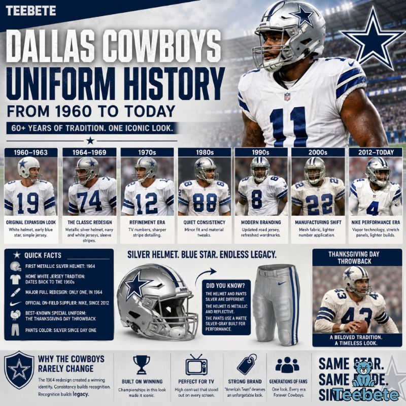
The History of the Dallas Cowboys Star Logo on Apparel
A single blue star, five points, no mascot, no wordmark. That’s the entire visual identity the Dallas Cowboys have leaned on since 1960, and it still shows up on more hoodies, jerseys, and snapbacks than almost any other emblem in American sports. Most NFL franchises have rebuilt their look five or six times over the same stretch. The Cowboys touched theirs once, in 1964, and left it alone. That kind of restraint is rare in branding, and it’s exactly why the star translates so well onto fabric, thread, and print, not just onto a helmet shell.
This piece walks through where the logo came from, why the 1964 update mattered more than people give it credit for, and how a football decal became a genuine fashion symbol worn by people who have never watched a full game. Along the way, we’ll look at how the design held up across decades of apparel manufacturing, how to spot a real vintage piece from a reproduction, and how the star stacks up against other iconic NFL marks when it comes to actually working on clothes.
Key Takeaways
- The Cowboys star first appeared in 1960 as a solid navy shape with no outline.
- A white outline was added in 1964, followed by a thin blue outer border in 1967.
- The design has stayed almost untouched since, making it one of the most stable logos in professional sports.
- Its two-color simplicity is what lets it embroider, screen print, and digitally print cleanly across six decades of apparel technology.
- The 1990s — powered by Troy Aikman, Emmitt Smith, and Michael Irvin, and stitched onto gear from Starter, Logo 7, and Apex One — produced the most collected era of Cowboys merchandise.
Why Is the Dallas Cowboys Star Logo So Iconic?
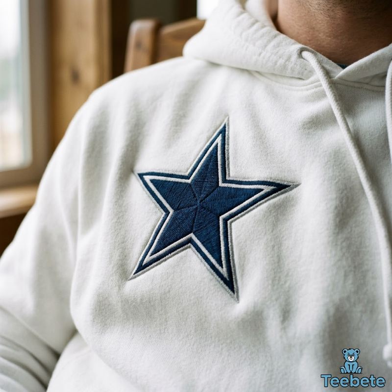
The Cowboys star works because it strips football branding down to one shape and one idea. Texas is the Lone Star State, and the team turned that regional identity into a five-pointed star with almost no extra detail. No animal, no cursive script, no crest. That simplicity is precisely what makes it hold up at any size, on any surface, from a stadium jumbotron to a two-inch embroidered patch on a chest pocket.
There’s also a practical design reason minimal logos tend to outperform complex ones on apparel. Detailed crests and mascots lose clarity fast once they’re shrunk down for a sleeve print or reproduced in a single thread color for embroidery. A five-point star doesn’t have that problem. It reads clearly whether it’s four inches wide on a varsity jacket back or half an inch on a cap. Apparel brands working with heavily detailed sports logos often have to simplify them for smaller garments. The Cowboys never had to make that compromise, because the simplification was already baked into the original 1960 design.
When Did the Dallas Cowboys Star Logo First Appear?
The Birth of the Original Blue Star in 1960
The Cowboys joined the NFL as an expansion franchise in 1960, and the club’s design work fell largely to Jack Eskridge, an early staff hire under general manager Tex Schramm and head coach Tom Landry. The first version of the logo was a solid navy blue star on a white helmet, with no outline and no border, just a clean geometric shape referencing the state’s nickname. It stayed in use for roughly three seasons before the team made its first, and so far only, meaningful revision.
How Early Fan Apparel Featured the Original Logo
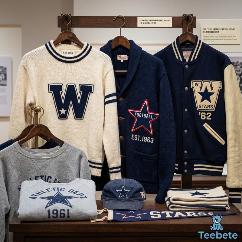
In the early 1960s, officially licensed sports apparel was nowhere near the industry it is today. Fans mostly wore wool sweaters, varsity-style jackets, and felt patches sewn onto letterman-style coats, since screen printing and embroidery technology were both limited compared to what came later. The solid star translated fine onto these early pieces because it had no fine detail to lose in the stitching. Anyone curious about how those early pieces compared to modern releases can dig into an early Cowboys apparel timeline for a closer breakdown.
Why the 1964 Logo Update Changed Everything
The Addition of White and Blue Borders
In 1964, Eskridge revised the star by adding a white outline around the solid blue shape, giving it a subtle 3D effect. Three years later, in 1967, a thin blue outline was added on top of the white border — the version still used today. The change looks minor at first glance, but it solved a real visibility problem. Against a silver helmet shell, a solid navy star tended to blend into the background under stadium lighting and on early television broadcasts. The white border created separation and contrast that the original flat version lacked.
Why the Updated Logo Worked Better on Clothing
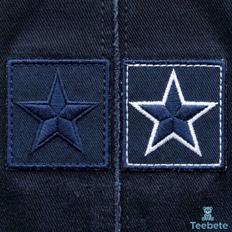
Here’s the part that gets glossed over on most fan sites: the border change did more for apparel than it ever did for helmets. A solid single-color star is genuinely harder to reproduce cleanly across different fabric and printing methods than a bordered one, and that difference shows up the moment you compare 1960s felt patches to modern embroidered polos side by side.
In embroidery, a single-color star can look flat and lose its edges against dark thread on dark fabric, since there’s nothing separating the stitch from the base material. Add a white outline and the digitized embroidery file has a built-in contrast line, which keeps the shape crisp even at small sizes on a chest or sleeve. In screen printing, the same principle applies. A flat navy star on a navy shirt is nearly invisible without a contrasting layer, but the white-bordered version pops immediately, which is why so much Cowboys merchandise uses navy or black fabric as a base. Direct-to-garment (DTG) printing, the more modern digital process used for smaller batch runs and custom apparel, benefits from the same color separation, since the printer needs distinct boundaries to lay down accurate layers.
Looking back, that small outline ended up solving a problem most people never notice. It gave manufacturers a logo that reproduces reliably on white shirts, dark shirts, embroidered patches, and printed graphics without needing a redesign for each format. That versatility is a big part of why the star has appeared on nearly every kind of garment for six decades without ever needing to be simplified or adjusted for different materials.
How the Cowboys Star Became a Fashion Symbol Beyond Football
The Rise of Licensed Fan Apparel
Through the 1970s, as NFL merchandising started to mature into a real business, the Cowboys benefited from being one of the league’s most televised teams. The franchise’s on-field success under Landry, paired with national broadcast exposure, meant the star showed up on more jackets, caps, and jerseys outside Texas than almost any other team logo of that era.
The Explosion of 1990s Sports Fashion
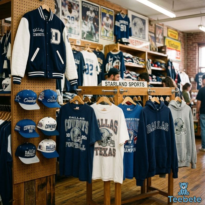
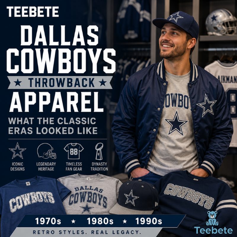
If there was ever a golden age for Cowboys fan gear, it was the 1990s. Walk into any sports shop back then and you’d see oversized Starter pullovers, heavily embroidered snapbacks, and boxy graphic tees built around that unmistakable blue star. Fueled by Troy Aikman, Emmitt Smith, and Michael Irvin — and three Super Bowl wins in four seasons — Cowboys merchandise turned into one of the biggest sellers in the league. Licensed manufacturers of the era like Starter, Logo 7, Apex One, and Pro Player leaned hard into heavyweight cotton fleece and dense chest embroidery, while companies like Sports Specialties and Chalk Line kept snapbacks and structured caps in constant rotation on and off the field.
Hip hop culture and sports fashion were colliding hard in this era, and a clean two-color star was easier to build a whole aesthetic around than a busy, multi-color crest. Puff print graphics, oversized silhouettes, and distressed-look tees all took the star and ran with it, and that same Starter-jacket-and-snapback pairing is exactly what a lot of today’s Y2K-inspired sportswear is trying to recreate.
Why the Star Logo Works So Well on Modern Apparel
The same qualities that made the star effective in the 1990s still make it a favorite for apparel designers now. Its symmetry means it can be centered on a chest without needing to be resized or cropped awkwardly. It scales up cleanly for oversized back prints, a dominant trend in current streetwear, and it scales down just as cleanly for embroidered polos and caps. The broader shift toward minimalist logo design across fashion in general has also worked in the Cowboys’ favor, since a shape that looked classic in 1964 doesn’t read as dated in 2026 the way more ornate or cluttered sports logos can.
Anyone shopping around for pieces built around this design has plenty of options these days, from vintage-style reproductions to modern athletic cuts, and browsing through how Cowboys apparel evolved is a decent starting point if you want to see how the range has grown.
Why the Cowboys Star Rarely Needed a Redesign
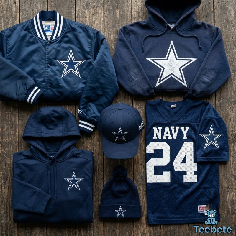
Most professional sports logos get more complicated over time, not less. Teams add gradients, drop shadows, secondary marks, and alternate logos as design trends shift, and every one of those additions eventually has to be simplified again once apparel manufacturing catches up and finds the original too detailed to reproduce cleanly. The Cowboys star did the opposite. It arrived stripped down in 1960, picked up one functional improvement in 1964, and then just… stopped changing.
That kind of restraint is closer to what Nike and Adidas do with their own marks than to what most sports franchises do with theirs. The swoosh and the three stripes work across every product category precisely because they lean on negative space and a single recognizable silhouette instead of illustrated detail. The Cowboys star follows the same logic, whether anyone in Dallas set out to design it that way or not. A shape this simple doesn’t age the way a detailed crest does, and it doesn’t need a “modern refresh” every decade to stay relevant, because there’s nothing dated about it to begin with.
Unlike many NFL logos that became increasingly detailed through the 1980s and 1990s, the Cowboys star moved in the opposite direction by staying almost untouched. That consistency paid off decades later. As apparel shifted from traditional embroidery to screen printing and eventually DTG production, manufacturers never had to simplify or redraw the artwork. The same logo worked on heavyweight varsity jackets, oversized 90s graphic tees, modern moisture-wicking jerseys, and even minimalist streetwear hoodies. Few professional sports logos have transitioned across so many manufacturing eras — different fabrics, different stitch counts, different printing technology — without losing their identity along the way.
How Vintage Dallas Cowboys Apparel Evolved Across the Decades
1960s and 1970s
Apparel from this era leaned on simple single-color prints and basic embroidery, largely because manufacturing options were limited. Felt patches and screen-printed cotton tees were the standard.
1980s
Graphics got bigger and bolder as screen printing technology improved, allowing for larger chest and back prints without cracking or fading as quickly as earlier methods.
1990s
This is generally considered the golden era for collectible Cowboys apparel. Heavy embroidery became standard on licensed gear, Starter jackets and Logo 7 pullovers were everywhere, and the team’s three Super Bowl wins that decade drove huge demand for officially licensed merchandise — a lot of which now circulates as sought-after vintage rather than casual fan wear.
2000s to Today
Modern manufacturing brought performance fabrics, moisture-wicking materials, and far more precise embroidery machines capable of tighter stitch counts. At the same time, retro-inspired collections using the original 1960 flat star design have become popular again, giving collectors two eras of the same logo to choose from on current apparel.
The throughline across all four decades isn’t really about design — it’s about manufacturing. Better embroidery machines, better print methods, and better fabrics let manufacturers do more with the same shape, which is a big reason the star never needed to be redesigned to stay relevant.
How to Identify Authentic Vintage Cowboys Star Apparel

If you’re hunting for genuine vintage pieces rather than modern reproductions or outright bootleg merch, check these details before buying:
- Logo proportions. Older prints and patches often show slightly different star angles than the current officially licensed template.
- Border thickness. Pre-1967 pieces should show only a white border with no blue outline layered on top.
- Stitch quality and stitch count. Authentic 1990s Cowboys jackets usually feature dense embroidery with visible layering and a higher stitch count, while many modern reproductions use flatter, more uniform machine stitching.
- Vintage tags. Look for period-correct manufacturer tags — Starter, Logo 7, Apex One, Pro Player, Sports Specialties, and Chalk Line are all names worth recognizing, since licensed NFL apparel makers have changed multiple times over the decades.
- Licensed branding. Genuine vintage gear usually carries an NFL Properties or NFL Players Association tag from its era.
- Fabric aging. Real vintage cotton and heavyweight fleece typically show natural, uneven wear patterns rather than artificially distressed fading.
- Print techniques. Older puff prints and screen prints often sit slightly raised and cracked with age, while modern reproductions tend to look flat and perfectly smooth.
What Makes the Cowboys Star Different From Other NFL Logos?
| Logo | Design Complexity | Apparel Versatility | Redesign History |
|---|---|---|---|
| Dallas Cowboys Star | Single shape, two colors | Extremely high | One update since 1960 |
| Green Bay Packers G | Letterform with shading | High | Several minor changes |
| Las Vegas Raiders Shield | Multiple elements, crossed swords | Moderate | Minor adjustments over time |
| New England Patriots Flying Elvis | Detailed figure, multiple colors | Moderate | Full redesign in 1993 |
| Pittsburgh Steelers Logo | Three hypocycloids, multiple colors | Moderate | Largely unchanged since 1962, but visually dense |
Logos built around a single, low-detail shape tend to age better and reproduce more cleanly across apparel types than logos built around illustrated figures or dense multi-color marks. The Cowboys star sits at one extreme of that spectrum, which is a big part of why it still looks current on a 2026 hoodie despite being over sixty years old.
The Meaning Behind Cowboys Colors and Their Role in the Logo
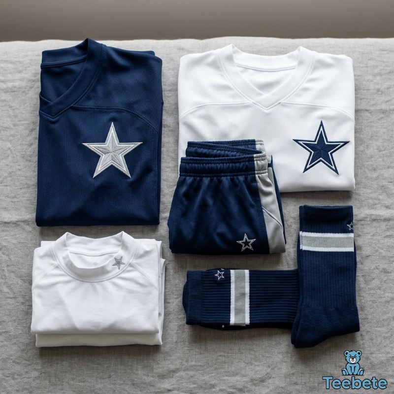
The Cowboys’ official colors are navy blue, silver, and white, sometimes described as royal blue in official branding materials. Blue reads as authoritative and stable, which fits a franchise that has spent decades marketing itself around consistency and tradition. Silver adds a premium, almost metallic quality that shows up across the helmet, the pants, and increasingly on apparel trim. White does the practical work of creating contrast, keeping the star legible whether it sits on a dark jersey or a light one.
On apparel specifically, this three-color palette gives designers flexibility that single-color team logos don’t have. A navy star on white fabric, a white star outline on navy fabric, or silver accents on either work interchangeably without ever looking off-brand. For a deeper look at how these shades were chosen and adjusted over the decades, the official Cowboys color history covers the topic in more depth.
Why the Dallas Cowboys Are Known as America’s Team
The “America’s Team” nickname didn’t come from the franchise itself. It came from NFL Films producer Bob Ryan, who was cutting the club’s 1978 season highlight reel and noticed how many Cowboys jerseys and hats showed up in the stands during road games, even in opposing cities. He worked the phrase into the film’s narration, and it stuck almost immediately once CBS broadcasters picked it up during the Cowboys’ 1979 season opener. Tom Landry reportedly wasn’t thrilled about it at first, worried it would give opponents extra motivation, but eventually warmed to the label.
That national exposure fed directly into merchandising. A team already being introduced on national broadcasts as America’s Team had an obvious head start when it came to selling jerseys, jackets, and caps outside its home market, and the star logo became the visual shorthand for that nickname. If you want the full story behind how the phrase was coined and adopted, the origin of America’s Team goes into the details.
Why the Dallas Cowboys Star Continues to Inspire Modern Fan Apparel
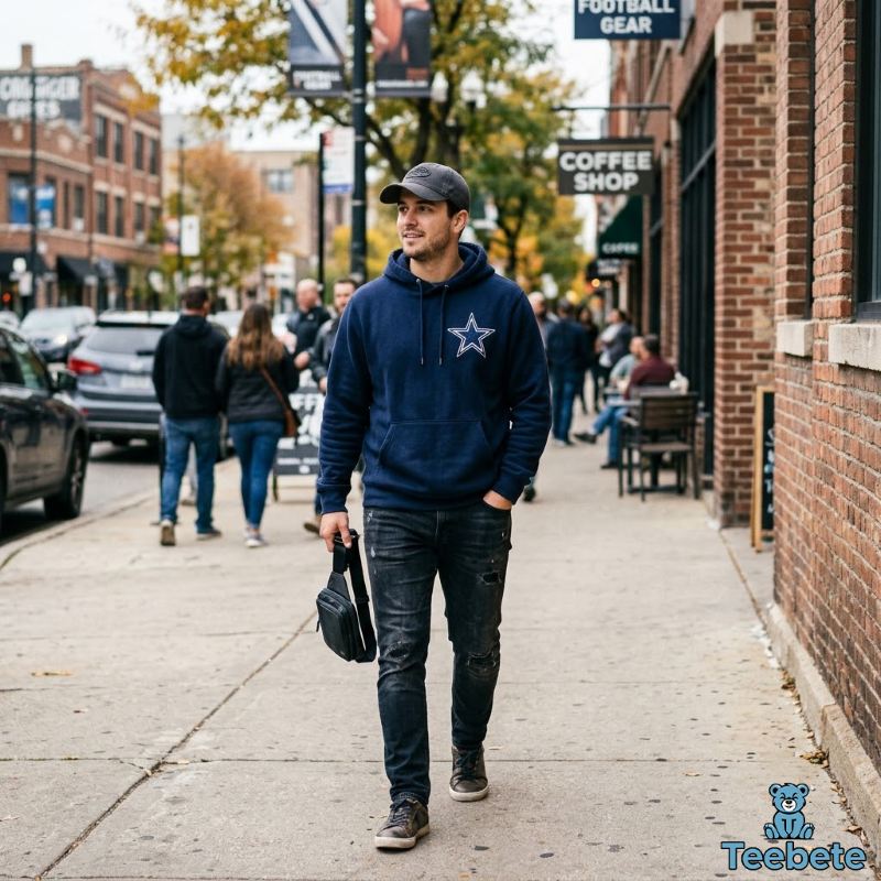
The design still shows up constantly in current fashion, from vintage-inspired reproductions of the 1960 flat star to heavily embroidered hoodies, oversized graphic tees, and retro-cut sweatshirts built around the 1964 bordered version. Collectors chase specific eras of the logo the same way sneaker collectors chase specific colorways, which keeps demand steady for both genuine vintage pieces and well-made modern takes on the same shape.
That same timeless simplicity is one of the design principles we follow at Teebete whenever we create retro-inspired Cowboys apparel. Rather than reinventing the logo, we focus on preserving the bold contrast and clean proportions that made it iconic in the first place.
It hasn’t needed a redesign because it was built simple enough from the start to survive one manufacturing shift after another.
Common Questions About the Dallas Cowboys Star Logo and Apparel
Has the Cowboys logo ever changed?
Only once in a meaningful way. The original 1960 star was a solid navy shape with no outline. In 1964 a white border was added, and in 1967 a thin blue outline was layered on top of that white border, creating the version used today.
Why is the logo a blue star?
It references Texas, nicknamed the Lone Star State, and the founding staff chose a simple five-pointed star as a direct nod to that identity rather than designing a mascot or illustrated figure.
When was the white outline added?
In 1964, credited to Jack Eskridge, who was part of the team’s early front office staff.
What decade produced the most collectible Cowboys apparel?
Most collectors point to the 1990s, driven by the Aikman-Smith-Irvin era of three Super Bowl wins and the rise of heavily embroidered licensed apparel from brands like Starter, Logo 7, and Apex One.
Why does the Cowboys logo look good on almost every clothing style?
Its simplicity is the main reason. A two-color, single-shape design scales cleanly across embroidery, screen printing, and digital printing without losing clarity, which isn’t true of more detailed or multi-colored sports logos.
How can you tell if vintage Cowboys apparel is authentic?
Check star proportions, border thickness, stitch quality and stitch count, tag details, licensing marks, and how the fabric and print have aged. Genuine vintage pieces almost always show uneven, natural wear rather than uniform artificial distressing.
Conclusion
The Dallas Cowboys star has remained virtually unchanged for decades, proving that timeless design often outlasts changing fashion trends. Its journey from a simple helmet decal to one of the most recognizable symbols in sports apparel reflects both football history and American fan culture.

Hi, I’m Mia Wilson. I’m a journalist and content creator based in New York with over six years of experience covering sports, holidays, fan culture, and community events across the United States. I focus on exploring team histories, traditions, celebrations, and the broader impact of sports and cultural events on local communities. I’m passionate about providing accurate, engaging, and educational content for readers of all ages, helping them understand the stories, experiences, and events that make sports and celebrations so meaningful.